
Friday, 12 December 2014
Elf and Dwarf Drawing Practice
We were given an assignment to draw both an elf and a dwarf, measuring their height with set head lengths. The elf had to be 9.5 heads tall, whereas the dwarf had to be 4 heads tall. Here is my result:
As always, I had a bit of difficulty drawing in Photoshop as well as I do in the program I'm used to - Paint Tool Sai. However I'm fairly happy with the result of these. I did find it a little odd measuring head heights as this isn't usually something I do, and it was strange having to trust the measurement rather than my own feeling of what felt 'right'. The elf was definitely easier to draw, the dwarf was a greater stretch of proportions and took more effort to look correct. The one thing I want to improve as a result of this exercise is to become better at creating things in Photoshop, as I feel I have become too reliant on the stabiliser tool found in SAI.
Wednesday, 19 November 2014
Insectoid Design
We received a task involving having to design an insect/humanoid creature. For this task, not only did we have to come up with an original design, but we also had to draw a front and side view of the creature as though we would be presenting it to be modelled.
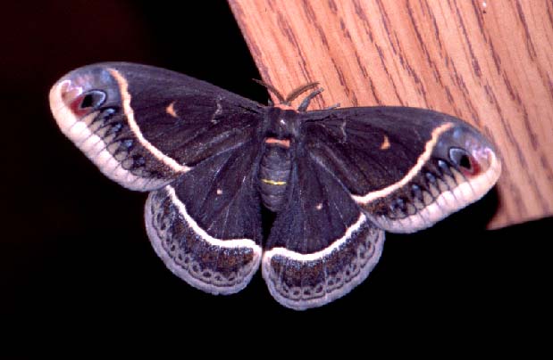
The idea I had for my creature was some kind of moth humanoid creature, and soon I decided I wanted to design a moth princess that would potentially rule over a civilisation of creatures. I started by looking at different images of various species of moths, to get ideas for the design.
 I was very interested in how this moth's wings looked like snakes, to scare off predators. This was one of the many things I decided to incorporate in my final design.


The idea I had for my creature was some kind of moth humanoid creature, and soon I decided I wanted to design a moth princess that would potentially rule over a civilisation of creatures. I started by looking at different images of various species of moths, to get ideas for the design.

After getting an idea of how I wanted the creature's anatomy to look, I began to design it's outfit. I wanted to dress it in a way inspired by asian royalty, so I began to look up different clothes and artwork from countries such as China, Korea and Japan.

I found that a lot of the materials in these images were very flowy and silky. I thought this would suit my creature well, so I made sure that the clothing in my final design would reflect this.
Here are both my front and side views of my creature, and the 3/4 view final design. My creature, as stated, is a moth princess that rules over her kingdom only during the night. Her main roles are to defend her kingdom against night time predators, and generally ensure that the civilisation remains stable during the hours of her reign. Her clothes are all handmade by herself, as she is a silk moth so she is able to produce the material. This is a tradition amongst the moth royalty, as it symbolises the fact that the princess should always work hard for her kingdom, and to always remain humble despite her position.
Friday, 7 November 2014
Turret Texture Baking
Today we baked a texture onto the turret model, and then painted the texture to give it a finished look. In order to do this, I opened the baked texture in Photoshop and then added a metal texture which I edited first to get the look that I desired. I then painted over this texture with a layer effect on in order to paint some graffiti decals onto the sides of the turret. Additionally, I added a small bit of blood using photos. Here are some screenshots of my finished texture on the model in Maya:


Speedpainting
In class today we had to copy an image we were given on paper, and we only had 2 hours to copy it.
Here is my attempt:

I went about doing this by putting each layer of the scenery on a separate layer in Photoshop, working from the mountains at the very back to the girl in the foreground. I'm glad that I managed to put down all the main features of the piece in time, and managed to make it look at least vaguely like the original reference image. However, I struggled with the perspective of the fence, as this is one of my weak points that I'd like to improve. Additionally, I feel that I could maybe have pushed the colours further, particularly with the highlights reflecting off of the objects, I feel that I could have made them lighter so that they 'glowed' more.
Here is my attempt:
I went about doing this by putting each layer of the scenery on a separate layer in Photoshop, working from the mountains at the very back to the girl in the foreground. I'm glad that I managed to put down all the main features of the piece in time, and managed to make it look at least vaguely like the original reference image. However, I struggled with the perspective of the fence, as this is one of my weak points that I'd like to improve. Additionally, I feel that I could maybe have pushed the colours further, particularly with the highlights reflecting off of the objects, I feel that I could have made them lighter so that they 'glowed' more.
Thursday, 6 November 2014
Halloween Monster Design
In the spirit of Halloween Week, our brief was to create a scary monster. Being a very broad prompt, I initially found it difficult to think of a direction to go in. So collecting images for my moodboard, they were not very focussed and rather were just images or designs I found appealing that vaguely fit the theme.

I found the idea of creating a giant monster quite appealing, inspired by the monsters from films such as Pacific Rim and The Host. However, whilst thinking about this I found that I was stepping too far into 'gentle giant' monster territory, which didn't exactly fit the prompt of 'scary'. So I eventually decided to scrap this idea completely, and focus on creating something more disturbing. Still, I was inspired by the limb shapes of the creatures I had studied, and eventually came to the idea of putting these strange proportions on a human figure.


I found the idea of creating a giant monster quite appealing, inspired by the monsters from films such as Pacific Rim and The Host. However, whilst thinking about this I found that I was stepping too far into 'gentle giant' monster territory, which didn't exactly fit the prompt of 'scary'. So I eventually decided to scrap this idea completely, and focus on creating something more disturbing. Still, I was inspired by the limb shapes of the creatures I had studied, and eventually came to the idea of putting these strange proportions on a human figure.
This was a mockup I did for the final design image of my creature. Initially its face was a mask of some kind, but then I eventually decided that it could actually be the shell of a bug instead, which attaches to its victims face, and causes the mutations which makes the monster look so disturbing. I chose to include a small bit of blood dripping down from the face, to indicate where the bug digs its claws into the victim. Still, I didn't want to rely too much on gore to make it scary, I wanted it to be more sinister and uncomfortable than gruesome.
This is the final result I had for my monster. I tried to push the lighting to give a more ominous feel, however I did struggle with the colours on this piece, finding it difficult to make it interesting. I also included another bug in the piece to show how it functions when not attached to a human.
Futuristic Gun Design
We recieved a brief which involved having to design a futuristic/sci-fi, projectile firing gun. As usual, I started out by collecting images on the internet, both to learn how guns work and also to get some ideas as to how to give my weapon a futuristic feel.

I liked the idea of having more round shapes in the silhouette of my gun, as I feel that this gave an interesting, almost otherworldly effect. Additionally, I noticed that bright, especially glowing, colours in the design gave a good sci-fi effect. With these two things in mind primarily, I began to sketch out ideas, focusing on creating good shapes and also getting used to drawing out the general structure of different guns.

From this, you can see that I chose my third design. However, I also took a few features from other designs, for example the handle and details on the barrel.
I decided to draw my final design from scratch in Photoshop. Here is my result:

As always, there are things I am pleased about with this piece, and things I feel could have been done better. I learnt a lot from drawing this; it was my first time drawing a gun, let alone designing my own one. I also used this drawing to get used to the more advanced features of Photoshop again, such as masking and layer effects. Next time, however, I would like to use thinner lines to give it a more realistic look, and focus on ensuring that the design is practical and would work in real life, as well as being aesthetically pleasing.
I liked the idea of having more round shapes in the silhouette of my gun, as I feel that this gave an interesting, almost otherworldly effect. Additionally, I noticed that bright, especially glowing, colours in the design gave a good sci-fi effect. With these two things in mind primarily, I began to sketch out ideas, focusing on creating good shapes and also getting used to drawing out the general structure of different guns.
From this, you can see that I chose my third design. However, I also took a few features from other designs, for example the handle and details on the barrel.
I decided to draw my final design from scratch in Photoshop. Here is my result:
Friday, 31 October 2014
Texturing Practice
We were given a texture map of an ordinary woman that had been pre-wrapped in Maya. We were required to edit the map in Photoshop, first to give it a different face, and then to 'zombify' it. Here are the images of my two results.


Fortunately, I didn't find this exercise too difficult, as I have a decent amount of experience in Photoshop already. This meant that I had more freedom when it came to my ideas, and I wasn't restricted to doing only what I could manage. However, I still did struggle with this a bit, as some of my ideas did require more skill to pull off than I had. For example, I wanted to edit the character's face to show some bone where her skin had rotted away, but I couldn't make it look effective or realistic enough to fit with the rest of the graphics on the model. Therefore, it is important that I practice more in Photoshop and become more experienced with it, so that there are more possibilities of what I can do in future assignments.
Fortunately, I didn't find this exercise too difficult, as I have a decent amount of experience in Photoshop already. This meant that I had more freedom when it came to my ideas, and I wasn't restricted to doing only what I could manage. However, I still did struggle with this a bit, as some of my ideas did require more skill to pull off than I had. For example, I wanted to edit the character's face to show some bone where her skin had rotted away, but I couldn't make it look effective or realistic enough to fit with the rest of the graphics on the model. Therefore, it is important that I practice more in Photoshop and become more experienced with it, so that there are more possibilities of what I can do in future assignments.
Sunday, 19 October 2014
Modelling a Turret
We were given an assignment which involved modelling a turret from a reference image that was provided for us. Here is a screenshot of my result:

This assignment was fairly challenging at first, as I still had little experience with Maya at the time. However, the more I modeled the more confident I became with the various tools and methods used to create objects in this program, and so I feel that this exercise was very useful in becoming more comfortable with Maya. I even chose to add a basic texture and colour to the model, even though it wasn't necessarily required.
However, I still struggled with a few aspects of this assignment. For example, I found that the 'bevel' function often didn't work as expected on this model, and I wasn't quite sure what was causing the problem, leading to several edges just not being beveled. Issues such as these show that I still have a lot to learn when it comes to Maya, however I feel more confident now about the basics of 3D modelling.
Thursday, 16 October 2014
project tentacles
For our Visual Arts project this week, we had to design a monster that had four or more tentacles. Whilst it wasn't the first time I'd designed a creature that fit this description, I still wanted to start from the very basics of researching and studying the individual aspects of what I thought I would want to include in my final design. Therefore, I started by collecting a few images with which to study primarily the anatomy of tentacles, but also to draw inspiration from other artist's work.
 Here you can see that I have primarily focussed on close-ups of tentacles, as I knew that a firm understanding of how they worked in real life would really help to make my creature seem more believable. I did however explore other artist's work, both which I already admired (such as with the kaiju designs in Pacific Rim) and that which caught my eye whilst browsing the web. I also chose to incorporate in this mood board a couple of the images I found of caterpillars which most affected my final design, and which I will discuss in more depth in a moment.
After collecting my images, I chose to do a few quick colour studies of the photos that most caught my eye, to get used to replicating tentacles in drawings as well as to generally improve my digital painting skills. Here are the two studies I finished, drawn with reference from two of the images I have in my mood board.


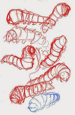


After collecting my images, I chose to do a few quick colour studies of the photos that most caught my eye, to get used to replicating tentacles in drawings as well as to generally improve my digital painting skills. Here are the two studies I finished, drawn with reference from two of the images I have in my mood board.
After completing these, I now felt confident enough to begin thinking about the way I would approach my own creature design. From the very start I knew that I wanted to step away from my tendency to create very cute and friendly designs, and instead come up with something that was genuinely frightening and monstrous. Eventually I decided to incorporate some bug-like qualities to my creature, as I felt that these kinds of features would evoke a very widespread feeling of repulsion with my audience. After thinking through various different options, I eventually came up with the idea of having a caterpillar-like creature with tentacles for legs, leading me to begin research into the anatomy of caterpillars as well. Very quickly I discovered that lots of species of caterpillar already looked like monsters!
Here are some of the quick studies I did from reference, followed by the initial designs for my creature.
(some features didn't make it into the final design, as I wanted to keep it relatively simple)
After finalising my design, I was finally able to create my final piece. I wanted to really push the fearsome nature of my creature, so I decided to present it attacking a dolphin, as this would also give more life to it and give my audience a bit of a greater insight into how it functions. With this in mind, Here are a few thumbnails I created whilst planning my final piece, followed by the final piece itself:
Ultimately I had mixed reactions about my final piece. On the one hand I was pleased to finish it at all, and am glad that I managed to stretch out of my comfort zone in almost every aspect of the piece (I have very little experience drawing animals, as well as environments, particularly underwater). However, without this context, I don't feel that it's a particularly successful piece. I wanted it to be much more dynamic and display more of a struggle between the two creatures, and to show off more of my monster's long underbelly mouth which is probably my favourite aspect of its design. As such, I intend to focus a lot more on composition in my next project when and where it is needed, so I can really push the emotions and message I am trying to convey with my art.
unfinished personal study :(
i thought i would upload a personal study ive been working on to improve my painting skills, based on a reference which was mainly used to render accurate colours and lighting. the form itself i ended up making more stylised. unfortunately i chose to drop this piece, at least for now, as i am too busy to focus on what would ultimately become a lengthy piece and would prefer to do multiple shorter studies instead to maximise my art output


Friday, 10 October 2014
bug study
for our visual art workshop today we had to to a copy of a bug painting using a certain technique which involved laying down flats over lineart and then painting over it. i found it quite fun but not particularly challenging so i adapted mine to make it more my own

Thursday, 9 October 2014
Maya Assignment- Modelling a fish
Our first assignment in maya was to model a fish, aided by a series of online tutorials which gave step by step instructions
I actually had to do pretty much the entire thing twice, as my first attempt had a few issues that I didn't know how to resolve. However, I feel that as frustrating as this was it was also beneficial, as it meant that I could reaffirm the skills I had learnt to ensure that I was entirely comfortable with everything after all.
here is my final result:

Tuesday, 7 October 2014
practice painting: Blood Witch
Here is the result of about a day's worth of practice (about 8 hours?) in painting digitally without the use of linework first. Unfortunately I completely forgot to save any progress shots so I only have the finished piece, but my process was effectively just blocking out colours and shapes first, and then adding detail as I went along.


Honestly I'm fairly pleased I finished this at all- usually I abandon paintings because I don't immediately like how they look. However following a conscious effort to stick with pieces for longer I managed to work something out. It is still clear from this final product what I need to improve on though- I feel that the face and hair are fairly well painted but the fabric and legs are a lot weaker. Additionally, I didn't attempt to design any more in depth background which I feel hinders the piece. As a result I will ensure that future practice revolves more around these aspects so that I can improve my skills.
Sunday, 5 October 2014
introduction or something
I suppose I should whip up some sort of post so that this blog isn't entirely empty...
So I'm a dorky 18 year old girl who's just started a course in Computer Games Art at UCA Farnham and I'm super happy to be here :> Expect (hopefully!) a lot of updates because I'm going to work super hard for the next three years. If I go a week without updating, feel free to send me angry emails to get my butt into gear :)
So just to pad out this post some more, here's a couple of recent pieces that I'm fairly happy with, although hopefully I'll improve quickly enough that I won't like them for long haha


For more art, feel free to visit my deviantart which is here :}
So I'm a dorky 18 year old girl who's just started a course in Computer Games Art at UCA Farnham and I'm super happy to be here :> Expect (hopefully!) a lot of updates because I'm going to work super hard for the next three years. If I go a week without updating, feel free to send me angry emails to get my butt into gear :)
So just to pad out this post some more, here's a couple of recent pieces that I'm fairly happy with, although hopefully I'll improve quickly enough that I won't like them for long haha


Subscribe to:
Comments (Atom)